Cyndx - Core Design System
Overview
At Cyndx, I spearheaded the creation of a scalable design system inspired by the Material-UI (MUI) framework to unify the user experience across our suite of AI-driven financial tools. The system was designed to address the need for consistency, accessibility, and efficiency in product development, catering to both designers and engineers.
By leveraging MUI’s robust component library as a foundation, I customized and expanded its design tokens, components, and patterns to align with Cyndx's brand identity and complex workflows. These Figma components were seamlessly implemented in Storybook, ensuring a cohesive design-to-development pipeline.
The result was a flexible, well-documented design system that improved product consistency, reduced redundancy, and accelerated the delivery of new features. This system became the backbone for our multi-platform applications, streamlining collaboration across teams and enhancing the overall user experience.
Problem
As Cyndx’s product offerings expanded to meet the needs of its growing user base, the limitations of the existing design system became increasingly apparent. While the previous system provided a basic foundation, it lacked the scalability and flexibility necessary to support a diverse and evolving product set.
Key Challenges
Limited Component Library
The component library was sparse and rigid, unable to accommodate complex use cases or align with new product requirements. Teams frequently built custom solutions, which led to inefficiencies and a lack of standardization.

Inconsistent Design Language
The existing system failed to enforce a cohesive visual language across products, leading to inconsistencies in UI elements and overall user experience. This resulted in redundant design efforts and a fragmented brand identity.
Lack of Scalability
As the product portfolio grew, the system struggled to adapt. It was not equipped to handle the needs of new products, features, or design patterns, making it harder to maintain consistency and quality.

Developer-Designer Misalignment
With no robust handoff process or alignment between design and code, discrepancies emerged between Figma files and implementation. This led to increased development time and rework.Accessibility Gaps
The system lacked a focus on accessibility, leaving usability gaps that hindered the experience for all users, particularly those with disabilities.
Addressing these challenges required a comprehensive overhaul—a scalable, robust design system that could evolve with Cyndx’s products while streamlining collaboration between design and development teams.
Goals
To address the challenges posed by the previous design system and support Cyndx's growing suite of AI-driven financial products, we established the following goals:
Create a Scalable Design System
Develop a flexible system capable of accommodating a growing product set, supporting new features, and evolving with future needs.
Ensure Visual and Functional Consistency
Establish a unified design language and reusable component library to deliver a cohesive user experience across all platforms and products.
Bridge Design and Development
Align design and engineering processes by integrating Figma components with Storybook, enabling seamless handoffs and consistent implementation.
Improve Efficiency
Reduce redundant design and development work by providing a comprehensive library of pre-built components, patterns, and design tokens.
Enhance Accessibility
Ensure all components meet WCAG standards to provide an inclusive experience for all users
Streamline Collaboration and Adoption
Build comprehensive documentation to facilitate cross-team collaboration and encourage widespread adoption of the design system.
These goals guided the creation of a robust and scalable design system tailored to Cyndx's unique product and user needs.
Design Process

STEP #1
UI Interface Audit
Conducted a comprehensive audit of the existing design system and product interfaces, identifying inconsistencies and gaps.

STEP #2
Defining Foundational Elements
Color Tokens: Established a scalable color palette with semantic names.
Typography Styles: Designed consistent text hierarchies for accessibility.
Spacing/Grids: Developed alignment and spacing rules to ensure layouts were clean and modular.

STEP #3
Built Core Components
Built a component library inspired by MUI’s framework, customized for Cyndx’s brand and use cases.
Designed flexible components with variants to handle complex workflows while maintaining visual alignment.
Annotated each component in Figma to guide developers on usage and states.
STEP #4
Translating the components to storybook
Partnered with developers to translate Figma components into coded versions in Storybook.Ensured Figma components and Storybook versions were aligned by:
Regular design/code reviews.
Creating a feedback loop for iteration.

STEP #5
Documentation & training
Since the design system was built on the MUI framework, we leveraged the extensive documentation provided on the MUI website as the primary resource for developers. This minimized the need to create separate technical documentation and ensured alignment with MUI's established best practices.
Training sessions and demos were conducted to help teams navigate MUI’s resources, utilize Storybook implementations, and apply customized Figma components effectively.
Preview
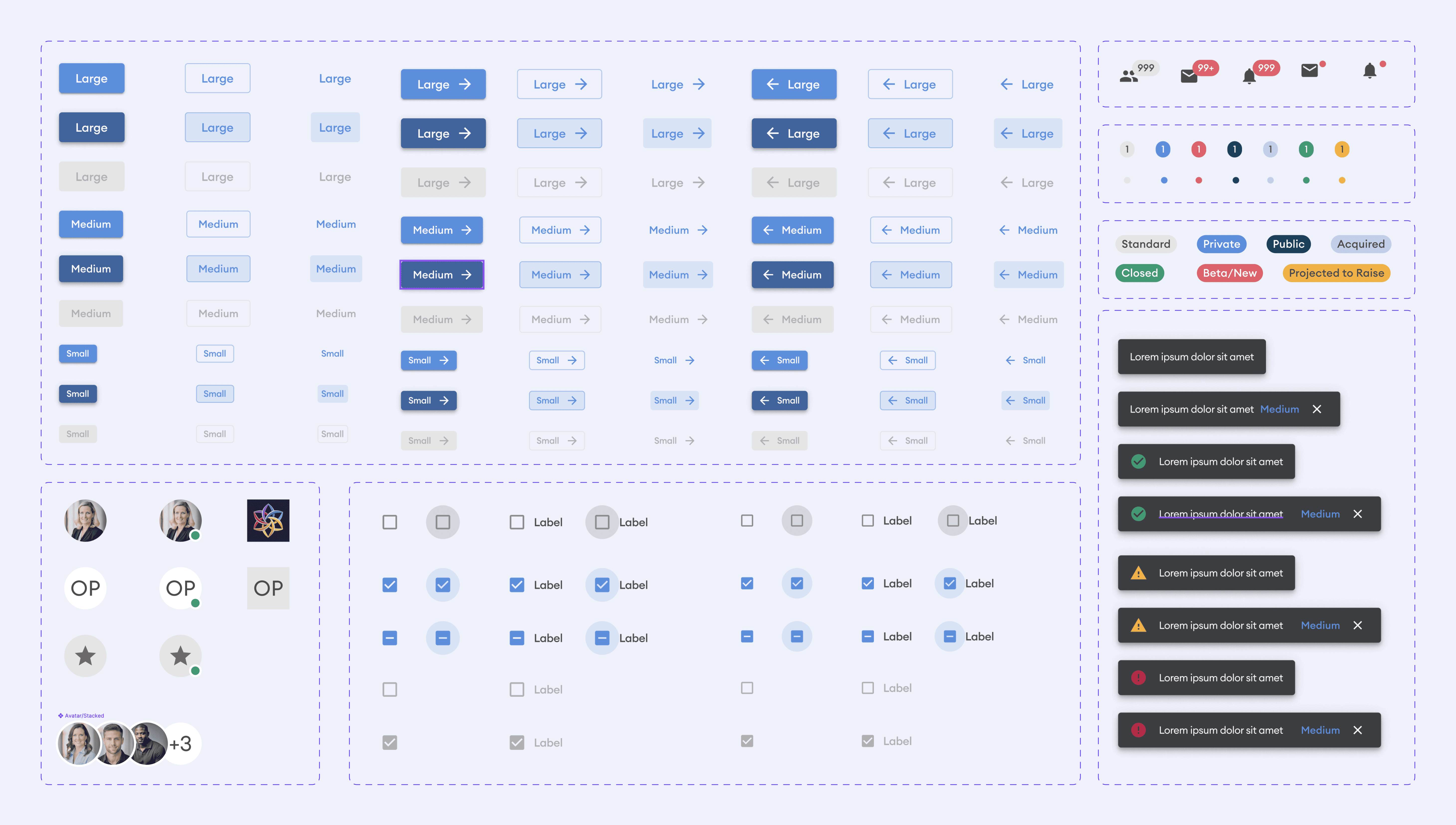
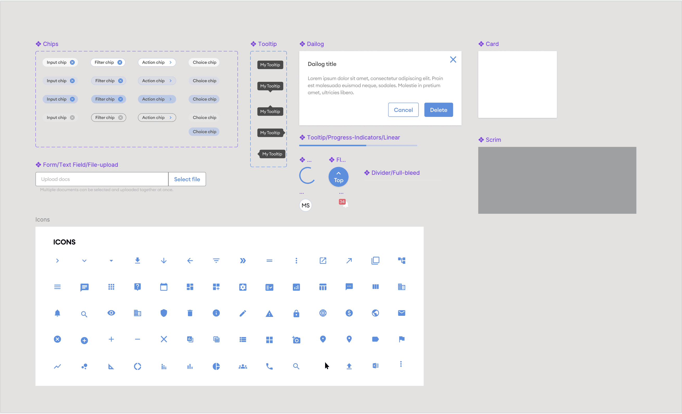
Here’s a look at the foundational UI elements and components used as building blocks for Cyndx products.
Theme & Text Styles


Input Elements


Navigation


Design System in Figma
View all the components on Figma.
Retrospect
Building the Cyndx design system was a transformative experience that reinforced the value of scalability, collaboration, and leveraging existing frameworks. By basing the system on MUI, we accelerated development and ensured alignment with industry best practices, though it required careful customization to meet our brand and product needs.
The project highlighted the importance of cross-functional collaboration, particularly in bridging the gap between design and development through tools like Figma and Storybook. It also emphasized the need for continuous iteration, as feedback loops and evolving product requirements shaped the system's growth.
Looking ahead, the experience underscored the potential for further refining the system, such as expanding its accessibility features and preparing it for new platforms. Overall, this project deepened my expertise in design systems and strengthened my ability to create scalable solutions that deliver consistent, high-quality user experiences.